
SAUCED
Launching a New Retail Brand with Clarity, Character and Confidence
Express

The Challenge
Sauced was about to open its doors - an independent vintage and streetwear store in the heart of St Marychurch, Torquay. The vision was clear. The visual identity to carry it wasn’t, yet.
This wasn’t a job for promotional flyers. It was about turning an idea into a brand people would remember before they’d even walked in.
Discovery
Every TWO30 project starts with understanding before creating. Working closely with the founder, we dug into the vision, the audience, the competitor landscape and what “launch day” needed to feel like.
One thing became clear fast: Sauced wasn’t trying to be another fashion retailer. It wanted to feel authentic, independent, and genuinely part of streetwear culture - not adjacent to it.
The other thing that became clear: the circular economy wasn’t a side detail for Sauced. Vintage and pre-loved fashion is inherently circular - but the founder was adamant the brand shouldn’t lean on the tired, worthy language of “recycled” or “sustainable” that so much of that space defaults to. The idea needed to feel like an edge, not an apology.
Strategy
Every touchpoint needed to say the same thing:
Independent. Curated. Streetwear. Community.
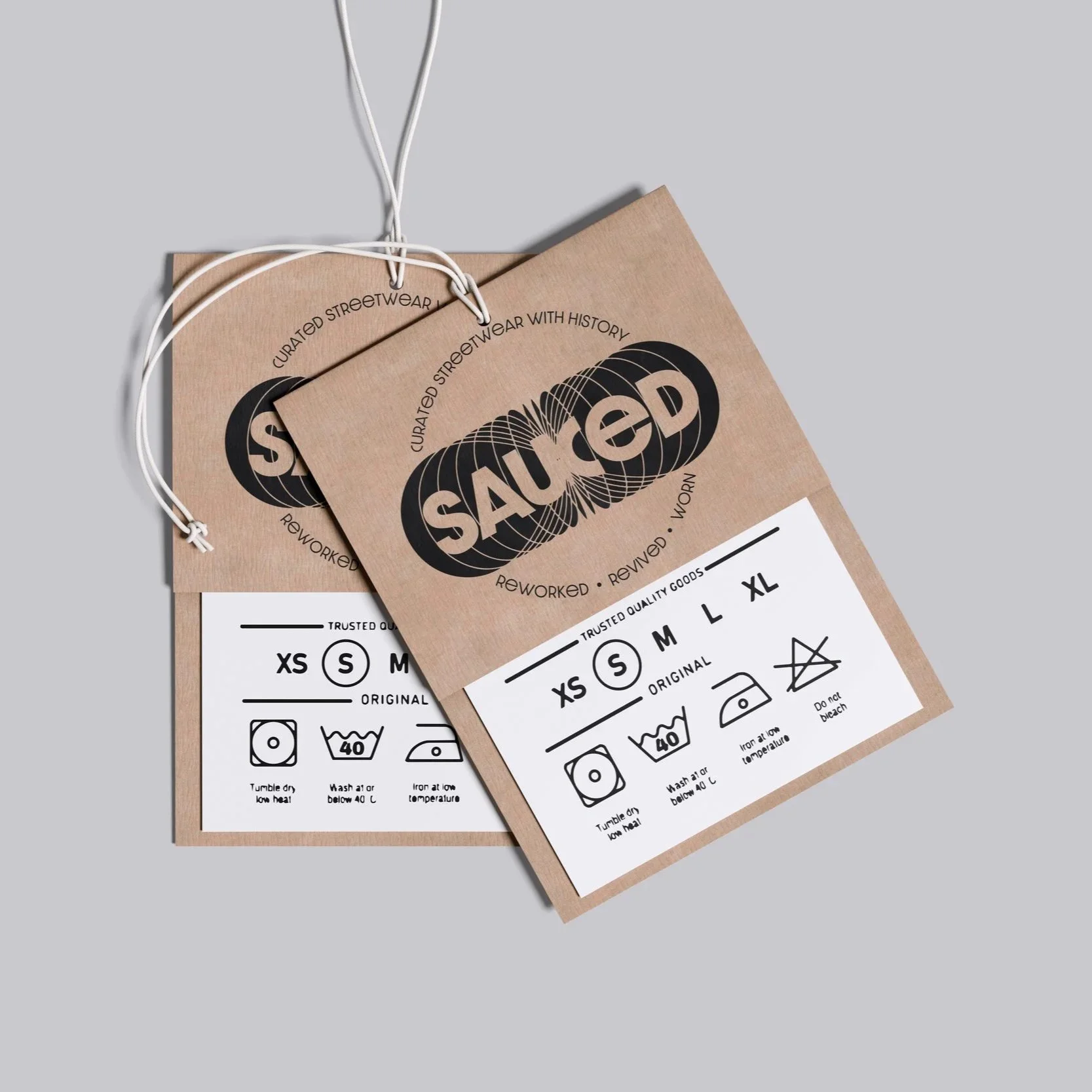
But underneath that, the brand needed a quieter second layer: a nod to circularity - global, ongoing, things coming back around - without ever reaching for a recycling symbol or the word “sustainable.” That tension shaped the identity more than anything else in the project.
Creative Development
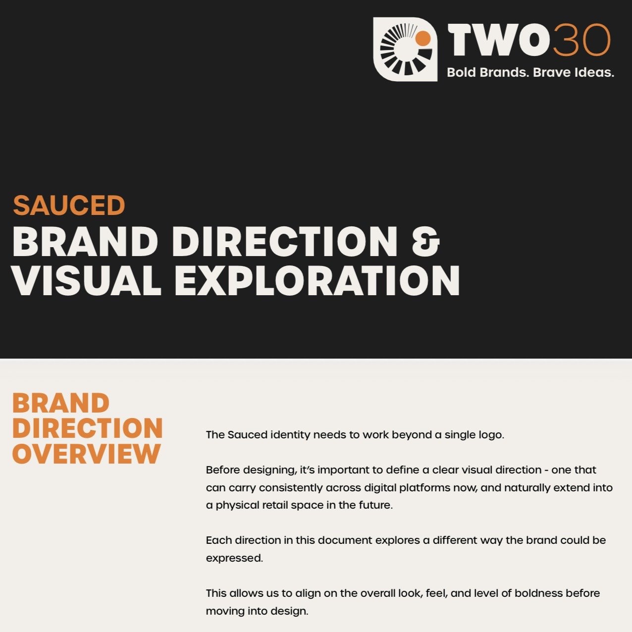
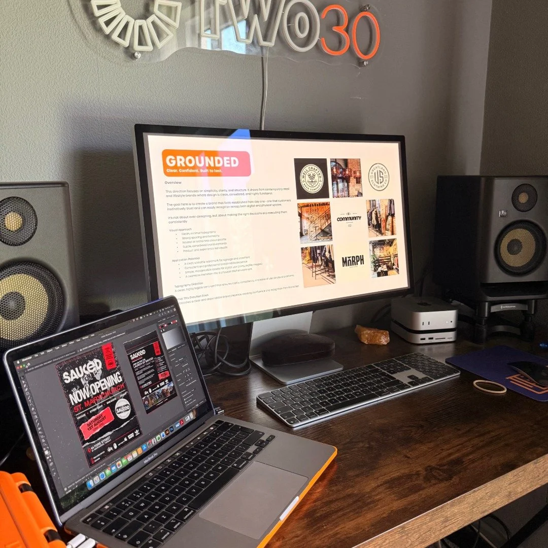
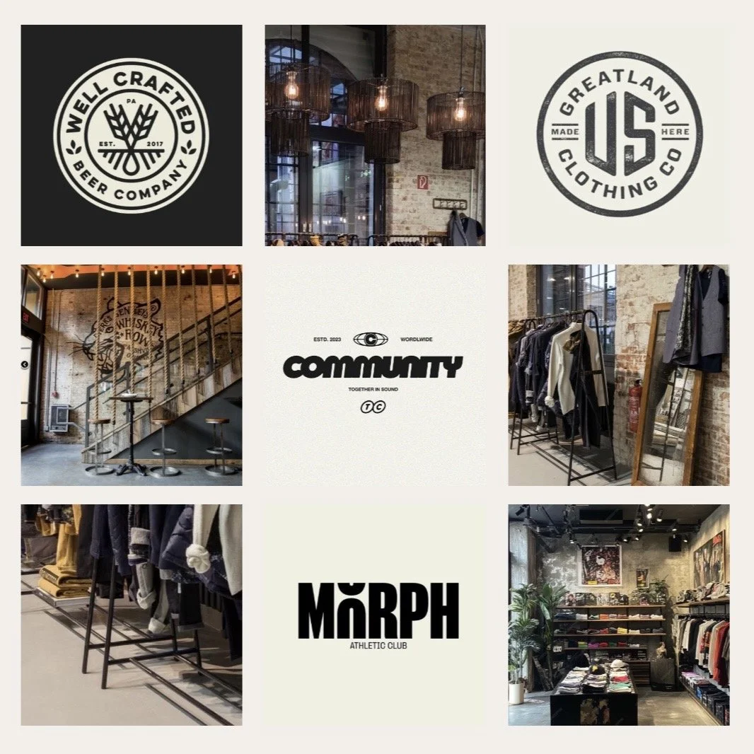
Every concept was tested against one question: “Would this feel at home alongside the brands Sauced sells?”
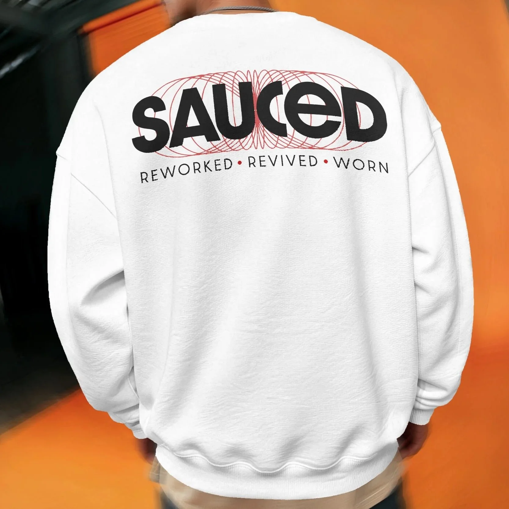
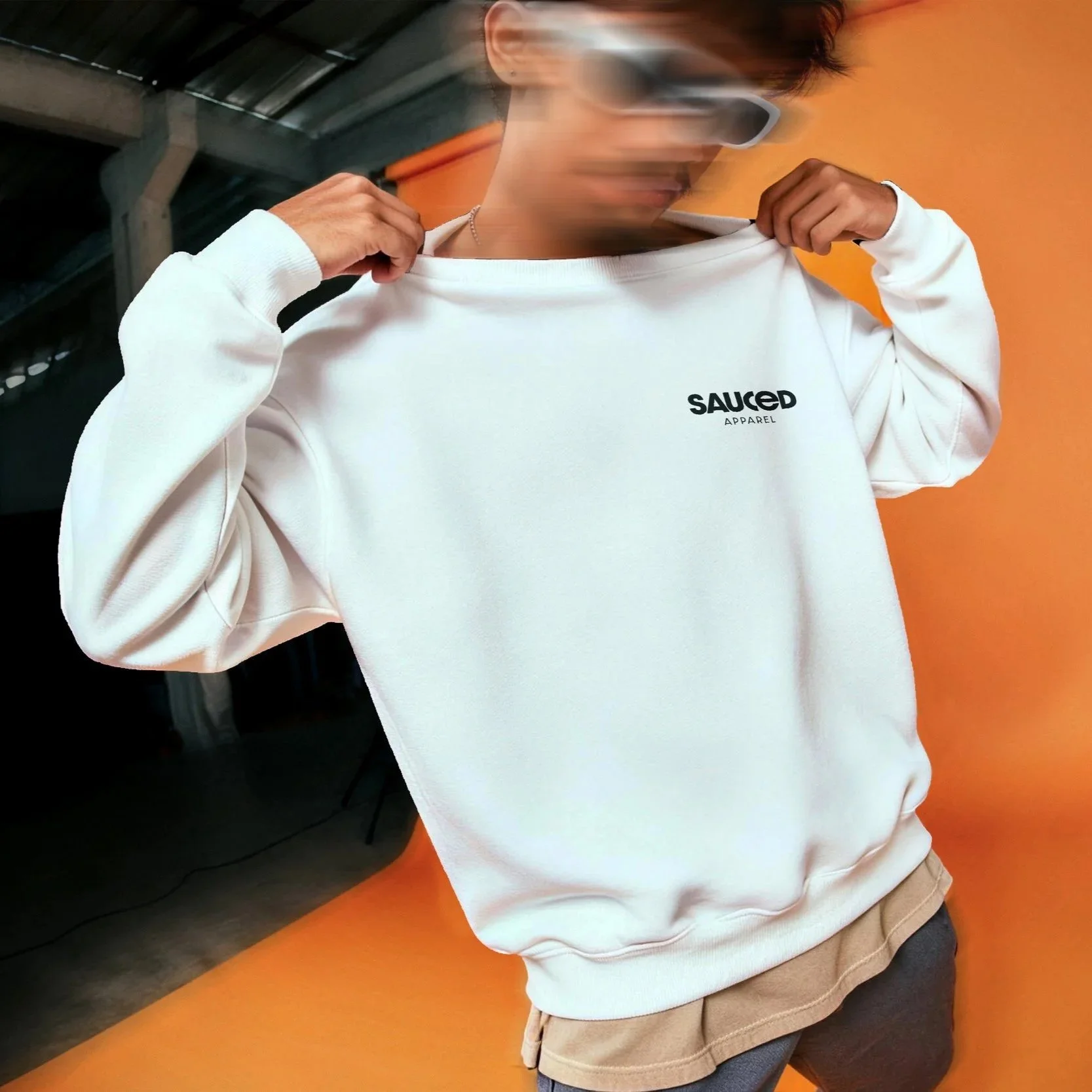
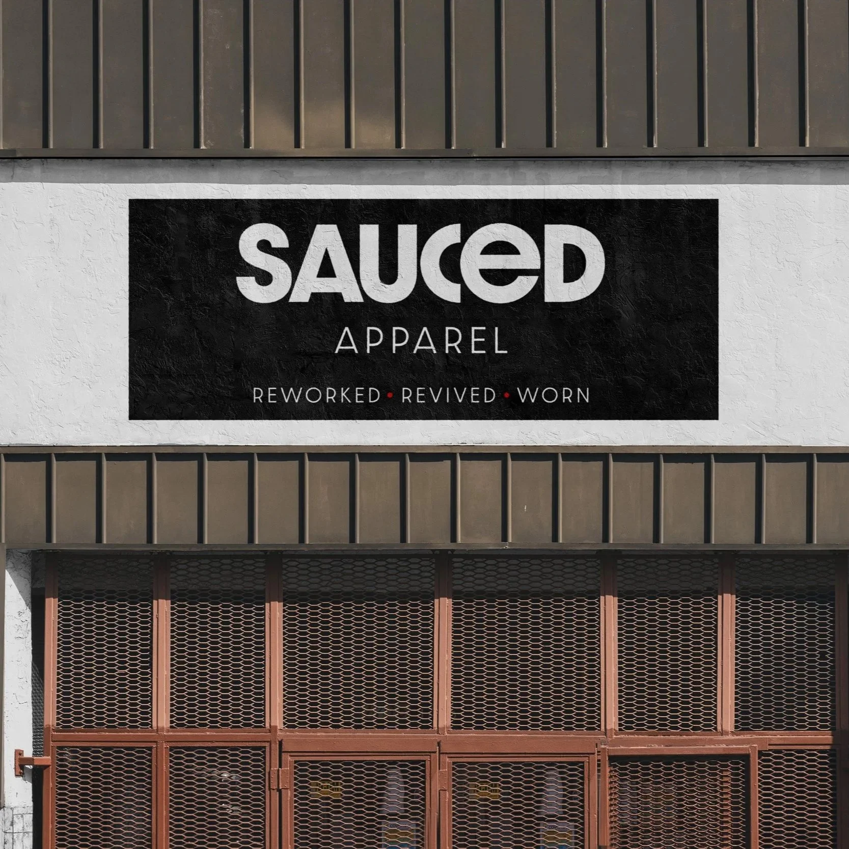
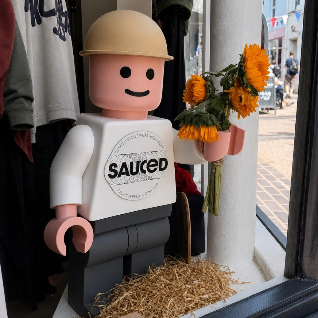
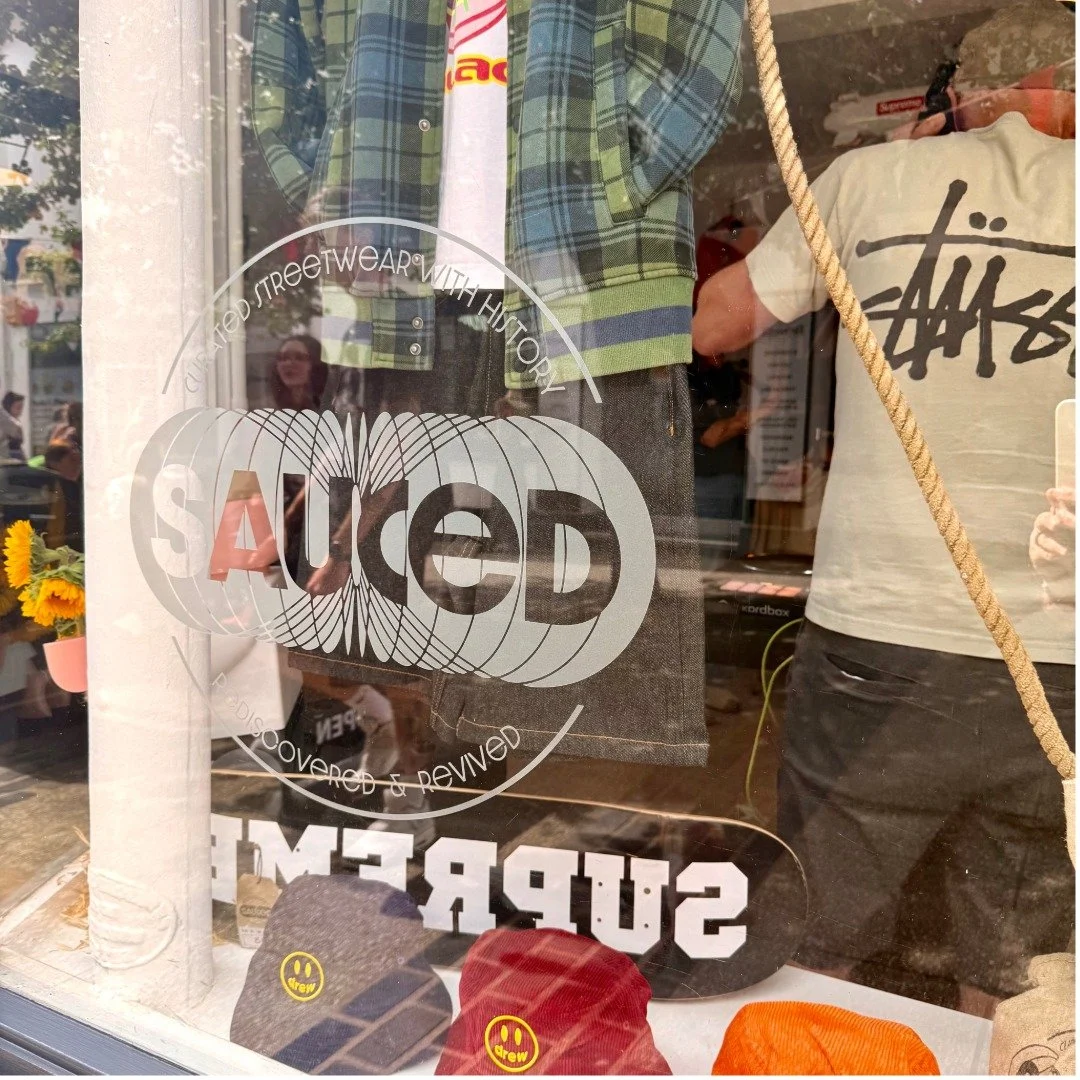
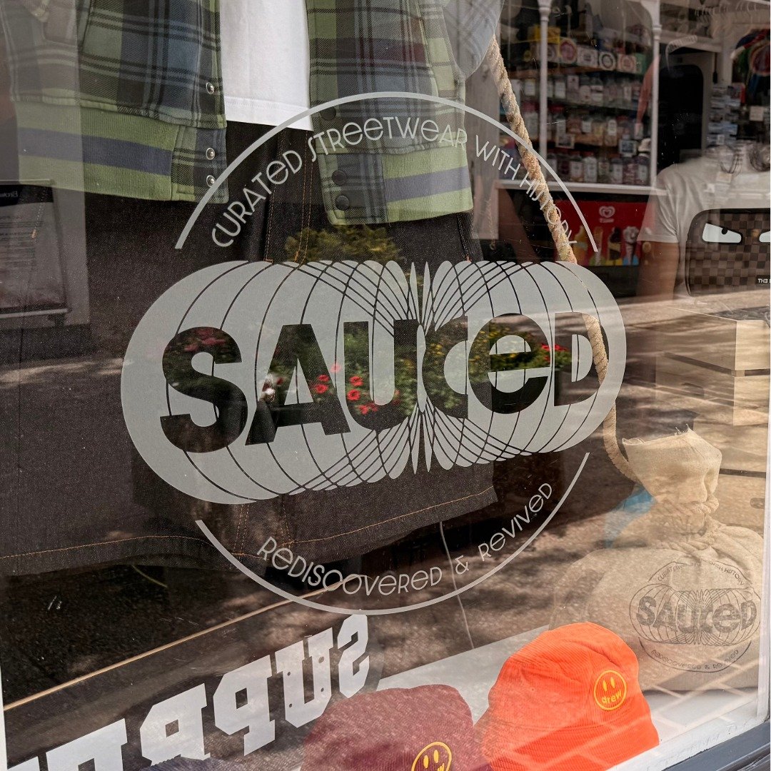
The answer led to the logo’s defining feature: a circular motion built into the mark itself - a visual nod to global circularity and things continuing to move, rather than a literal recycling cue. It reads as motion and edge first, sustainability second - exactly the order the founder wanted it in.
Typography, layout and colour balance were refined until the whole system felt like it belonged on the same rail as the stock inside - with that circular idea sitting quietly underneath everything else.
Design & Production
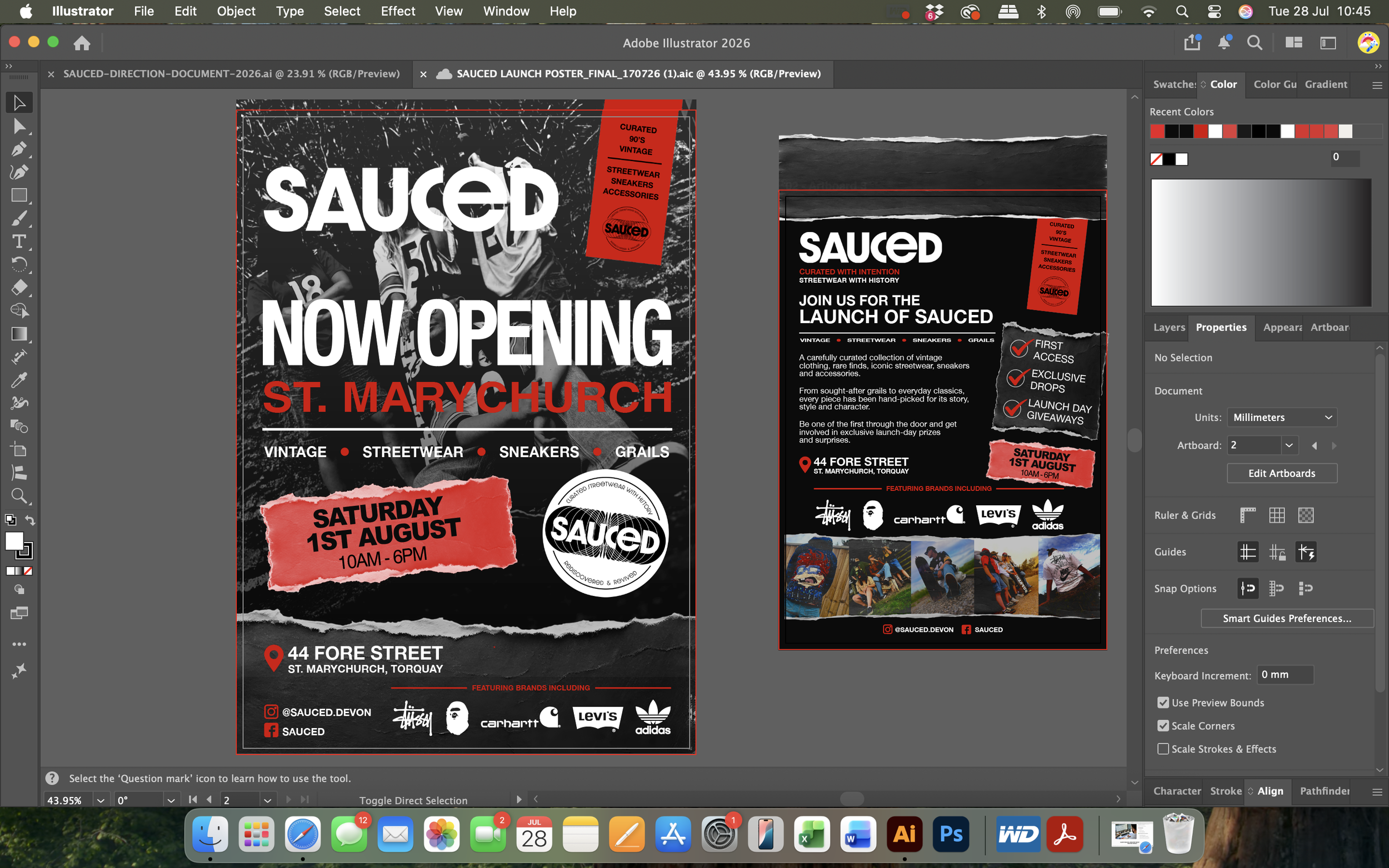
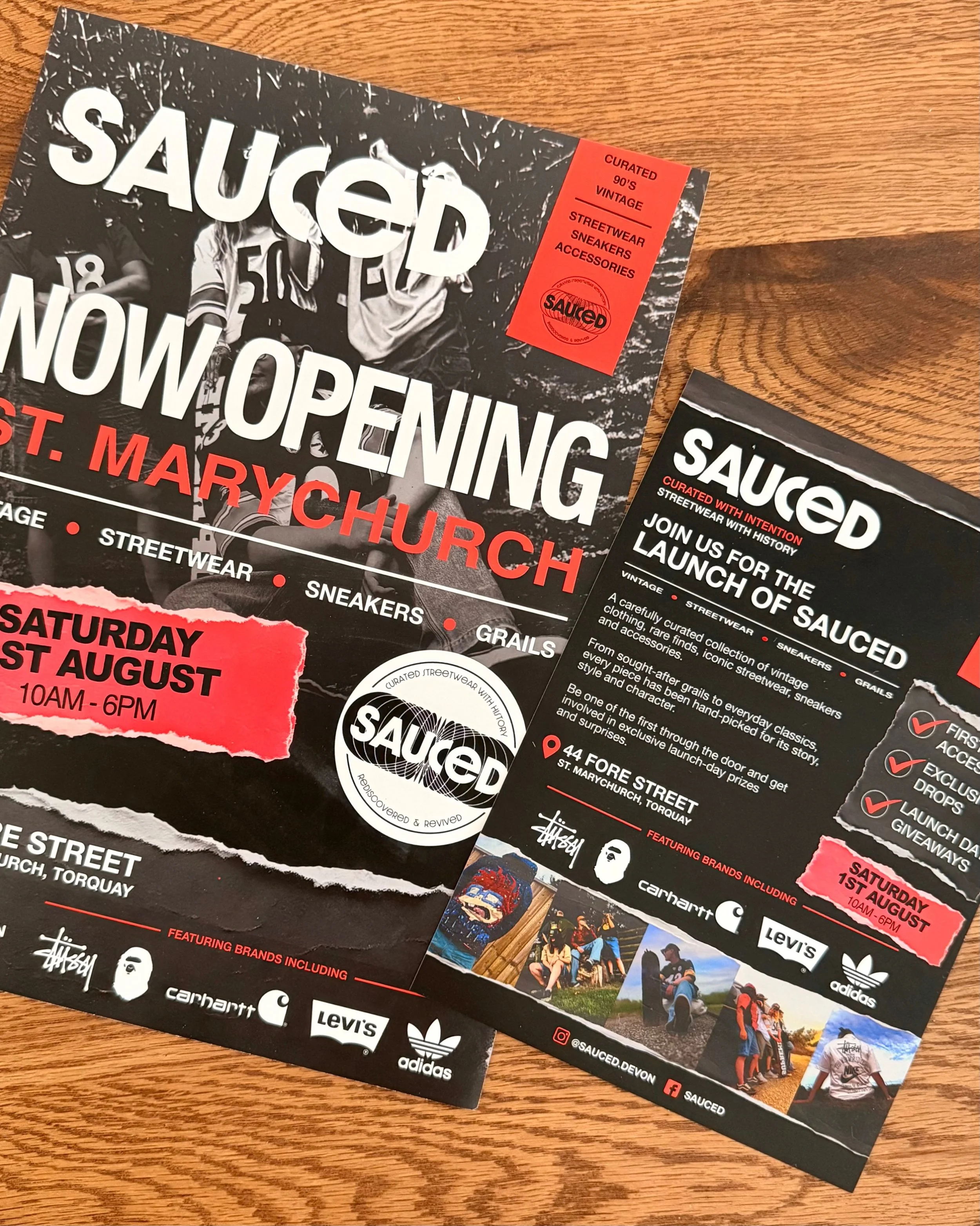
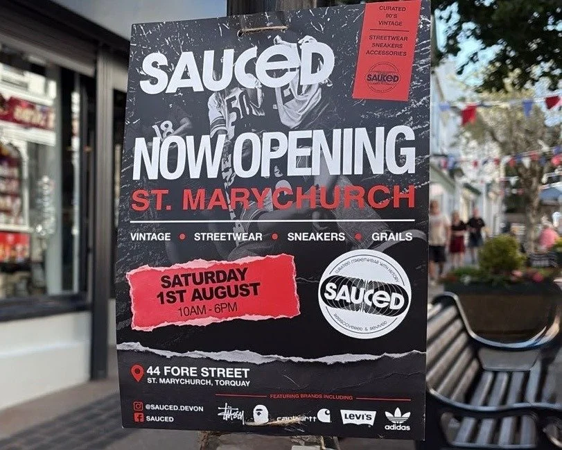
TWO30 delivered a full launch campaign built to work as one connected experience:
Launch poster & promotional flyer
Print-ready artwork
Launch messaging & typography hierarchy
Social media graphics
Print production and artwork preparation for commercial printing
Every piece designed digitally-first, then production-checked to make sure it held up exactly as well on paper as on a phone screen.

The Outcome
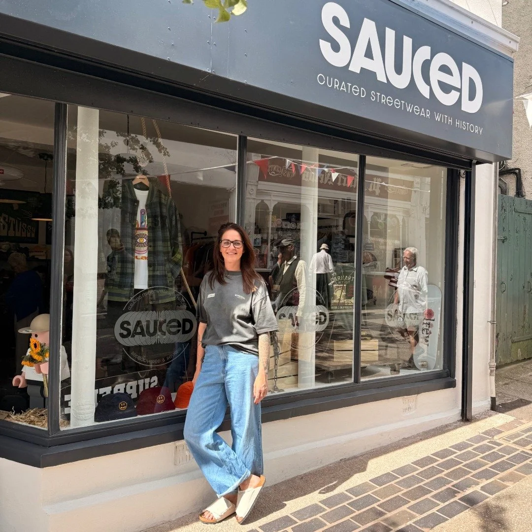
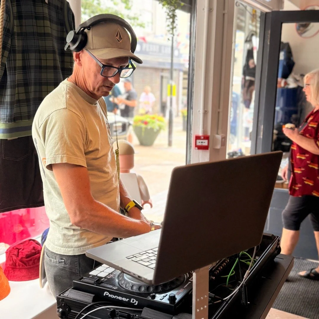
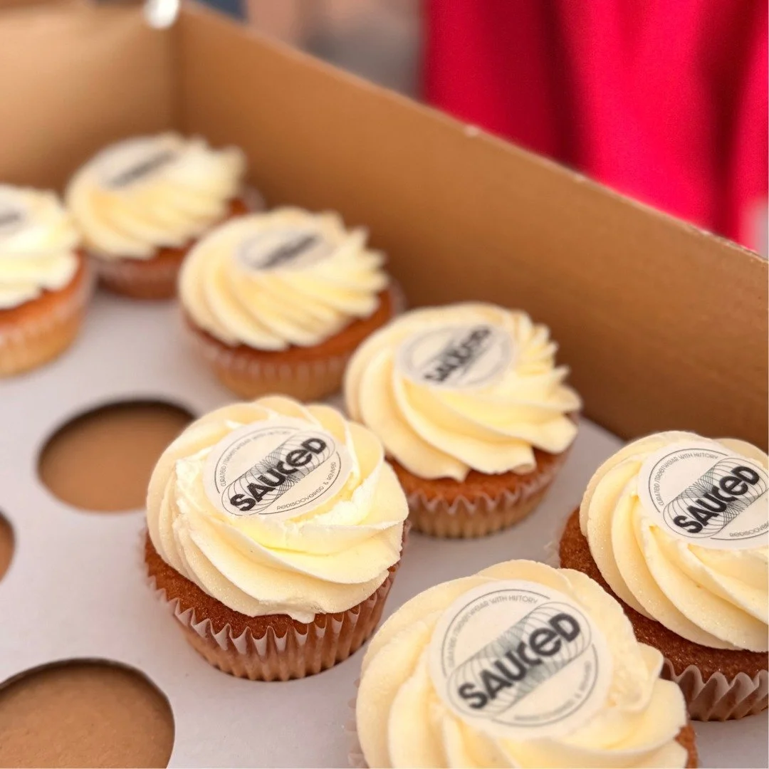
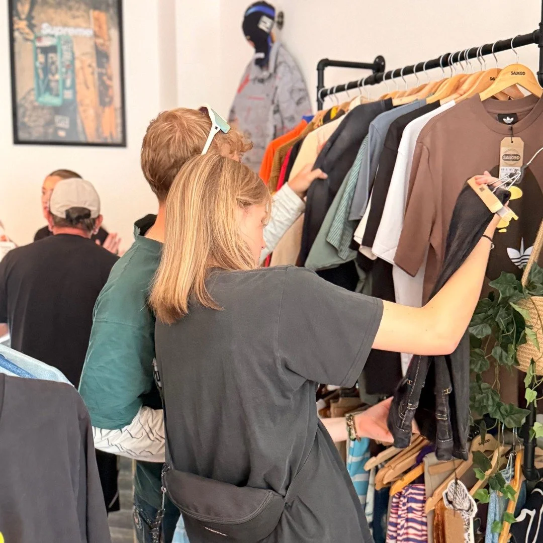
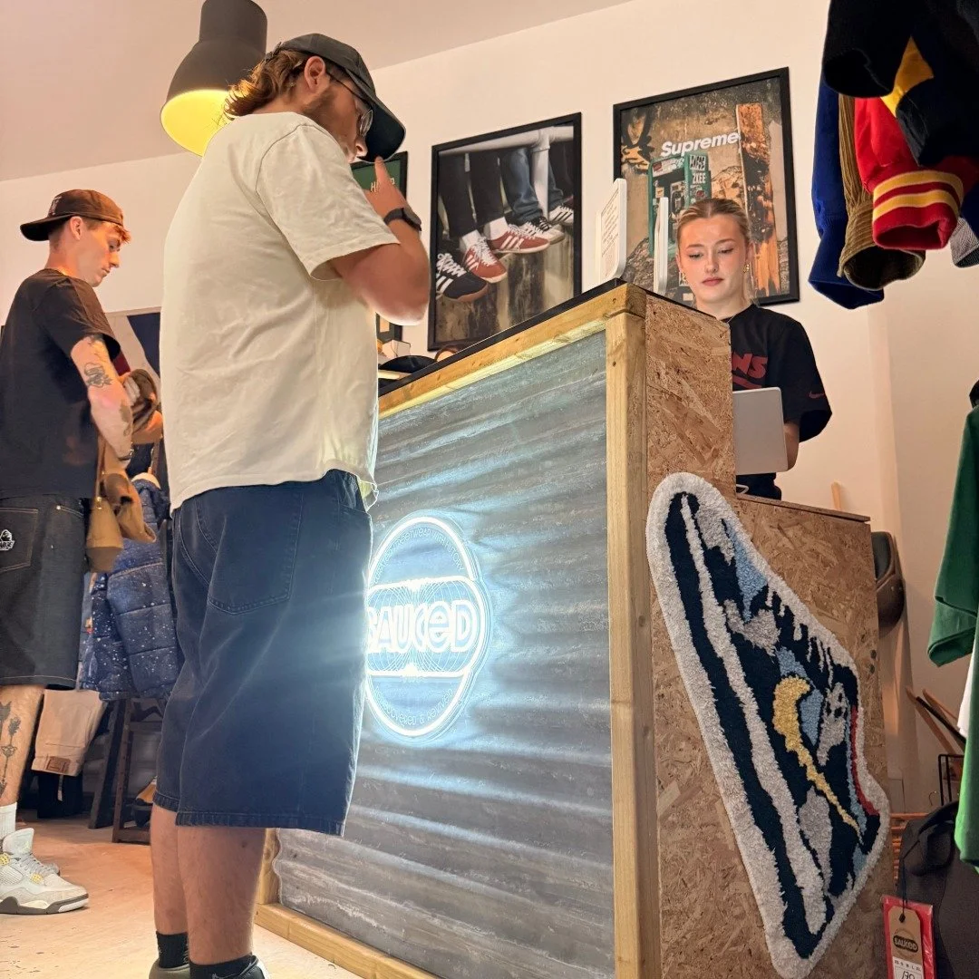
Sauced launched with a brand that felt considered from day one - not a set of scattered marketing pieces, but one consistent visual language across every touchpoint, carrying a genuine idea underneath it rather than a decorative logo.
Why It Matters
Good design doesn’t just look good. It sets expectations, shapes perception, and builds confidence before anyone’s set foot in the shop.
For Sauced, the brand carries something most vintage retailers don’t bother getting right: a real point of view on circularity, built into the mark itself rather than bolted on as a slogan. The launch materials weren’t just promotional graphics. They were the first chapter of the Sauced brand story.
Services Provided
Brand Discovery · Creative Strategy · Competitor & Visual Research · Creative Direction · Campaign Development · Graphic Design · Print Design & Production · Launch Campaign · Marketing Support
Client: SAUCED Independent Vintage & Streetwear Retailer
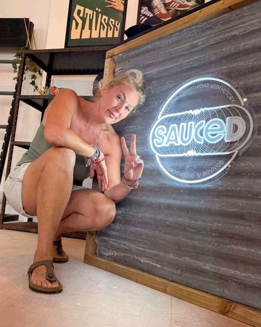
“Julia is incredible!! …She comes highly recommended and will definitely be working together in the future.”
Kate Eldridge-Pace, SAUCED