
Sushi Dojo
Exploring How Brand Identity Can Reflect Craft, Discipline and Simplicity
Project Type: Concept Brand Identity

The Brief
A self-initiated concept exploring how a restaurant brand could communicate the precision and discipline of traditional Japanese sushi making - without leaning on visual cliché.
The question driving it: how can restraint become the brand’s greatest strength?
The Thinking
Most Japanese restaurant identities lean on familiar, decorative cultural references. This concept went the other way - clarity, confidence and considered simplicity, built around one idea: mastery comes through precision, not excess.
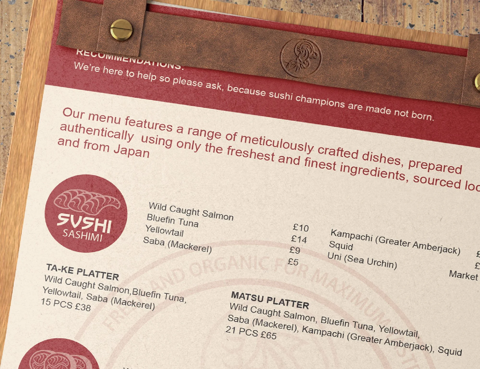
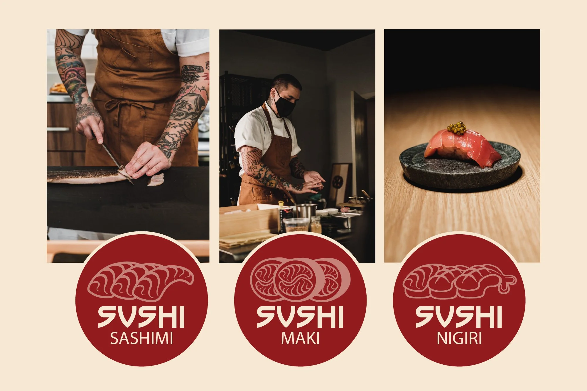
Explored across typography, symbolism, packaging, menu design and environmental
branding, every element reinforced the same restraint.


Creative Direction
Minimal forms. Strong typography. Careful use of space. A restrained palette and refined hierarchy - designed to feel calm, confident and considered.
Why It Matters
Concept work creates room to test ideas without commercial limits. Many of the principles explored here still shape how TWO30 approaches identity design today.
Services Demonstrated: Brand Strategy · Brand Identity · Creative Direction · Packaging Concepts · Print Design · Brand Collateral